Product: Traditional biscuits
Skills: Brand design
Date: 2023
Morriñas de Castaña is a brand of artisan biscuits made with chestnut flour.
For its launch, the brand needs to develop a visual identity in line with its values of quality, tradition, craftsmanship and sustainability.
Logo construction
For the development of the identity, the client had a typographic logotype in mind, but the inclusion of the isotype with the 3 chestnut leaves was proposed in order to gain versatility.
Colours
In terms of colour, the identity lives on in autumnal tones that are reminiscent of nature and sustainability, and gold accents are added to underline the quality.
Typography
The typographic selection of the logo has to respect the traditional and artisan character of the product. Google Fonts fonts have been chosen to simplify usability.


Packaging design
Once the brandbook has been developed with the main lines of the visual identity already established, the most urgent need is the design of the first packaging of the product.
Box and envelopes
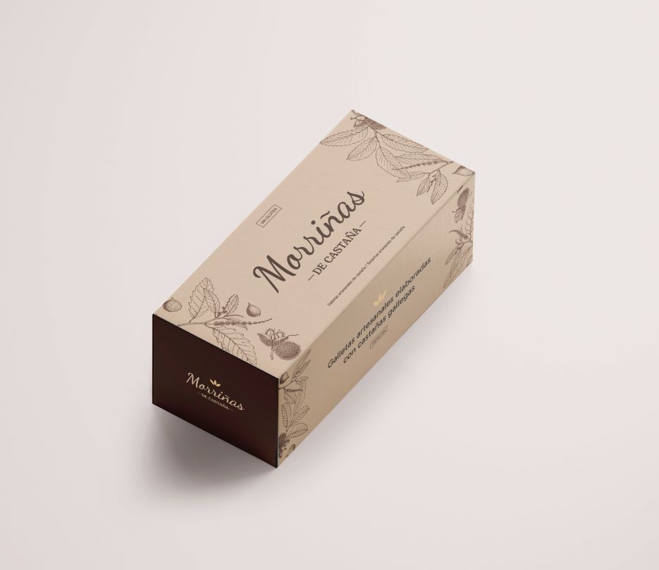
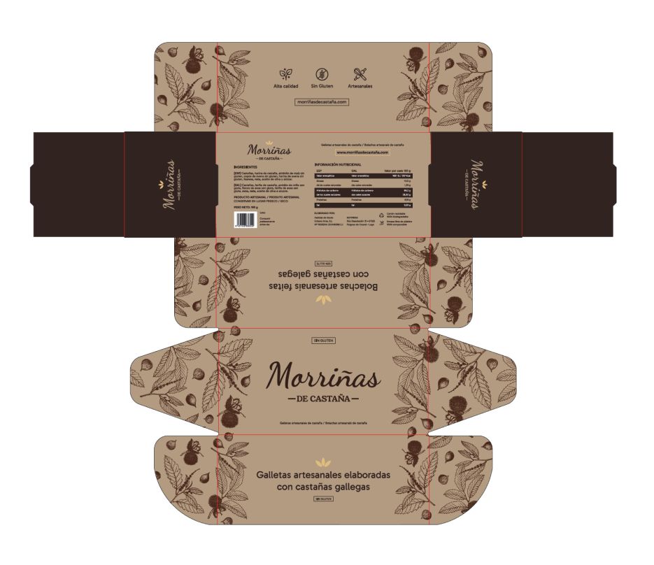
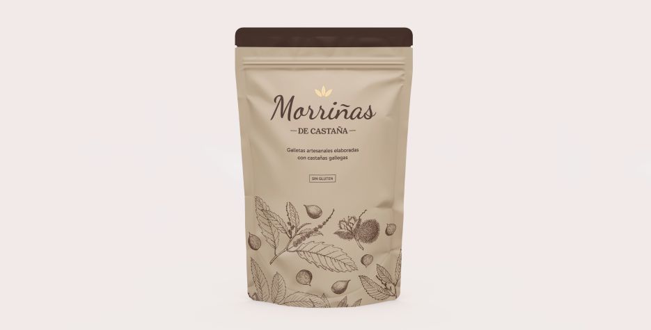
The Morriñas de Castaña box is designed in parallel to the logo itself, iterating until reaching the final artwork with illustrations of leaves and chestnuts, one of the key assets for the identity. For the adaptation to envelopes, the same design philosophy is maintained.
Use of colour
The brown band and the background on the sides of the box exist as an indication of the type of product, opening the possibility in the future for other varieties to be identified with another colour.